How many times have you been wowed by the use of colour in an interior, yet when it comes to choosing a palette for your own home you fall back on the safety net of usual bland shades? It’s fair to say that as a nation, we remain firmly neutral when it comes to decorating.
For Farrow & Ball customers, Joa’s White and Elephant’s Breath are favourites, while paint brand Lick’s top sellers include White 02 and Taupe 03. But perhaps choosing the safe bet isn’t always what we want: we’re just too intimidated to go for something more colourful. According to the experts, however, rather than looking at colours in isolation, we should pair them in failsafe combinations to create interesting, elegant and personal schemes.
Rob Abrahams, co-founder of COAT Paints, believes decorating should start with understanding colour theory, using the colour wheel, which shows the relationships between different colours.
“Colours next to each other on the wheel are great for a cohesive scheme as they’re often found together in nature, while colours that appear opposite one another are ideal for creating contrast,” he says.
He also advises using the 60-30-10 rule: “Choose one colour for 60 per cent of the space, which is often the walls; then, use another for 30 per cent, in a complementary or contrasting shade.”
The final 10 per cent can be given to a wildcard accent colour to create visual interest. “Interior designers live by this rule when building palettes that feel effortlessly sophisticated and ‘designed’,” says Rob.
Here, interior designers share five fail-safe colour combinations to try.
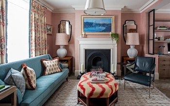
Pink and green
Interior designer Henry Prideaux says:
“Pink and green is such a common colour combination in the botanical world that it naturally translates well to being used in interior design. For rooms that are to be shared across genders, such as a bedroom or living room, pink and green creates a nice balance with which to decorate, as this pairing can cover various tastes.
Green connects people to nature and, in turn, is a calming colour, while pink creates a sense of romance and comfort – so together, they are a great, soothing combination for interiors.
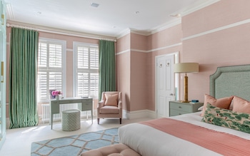
“Given its links to the natural world, it’s perhaps not surprising that this combination has been used in many historical buildings, for example, the Eating Room at Osterley Park by the Neoclassical architect Robert Adam is a good example of muted pinks and green working in perfect harmony.
“Which colours you choose really comes down to who is going to be using the space. For example, I might not use a ‘Barbie pink’ that often, but paired with a grassy green it can be perfect for a youthful interior. You should also think about how the rooms are to be used – a dining room that is used less regularly for evening dinner parties could accommodate much deeper hues than a bedroom, where you would want more calming and peaceful shades.”
Paint pairings to try
“I plan to use Edward Bulmer’s Jonquil 20 per cent as a calming backdrop to my own kitchen, where it will be paired with Dried Sage by Dulux as an accent colour on the garden doors for a little drama.”
“For a bolder finish and a little more impact, the jewel-toned green, Puck by Little Greene pairs well with a popping pink shade, such as Carmine, also by Little Greene.”
Green and yellow
Interior designer Tiffany Duggan says:
“Green and yellow is one of my favourite combinations. When used together, green and yellow tones offer a really fresh, invigorating feel to a space, while also feeling very natural and calming.
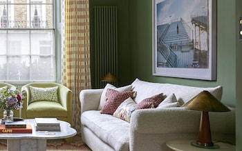
It is such a timeless option because any colour scheme rooted in the natural world is never going to fall out of favour. Softer, muted sage greens work well with buttery yellow and camel, while a more vibrant apple green can handle a brighter yellow tone.
“The balance of the tone is key – as yellow and green are on the same side of the colour wheel, not every green will work with every yellow. Pastel yellow and a bronze khaki would be a tricky combination to pull off. I usually end up adding a little red, lilac or pink to a room heavy in green and yellow to provide a little balance. I usually lean more towards a more dominant green, with yellow as an accent; but as long as the yellow is soft, it can certainly work as the more dominant colour.”
Paint pairings to try
“Light Gold by Little Greene is a warm colour, originally conceived from chrome yellow, white and a dash of vermilion, which pairs well with Little Greene’s Boxington, a reduced lime with added red-oxide of iron.”
“Chelsea Green II by Paint & Paper Library, a classic Adam green from the 18th century, is brought up to date when paired with Scallion, a vibrant and brilliant shade, also by Paint & Paper Library.”
Brown and blue
Interior designer and paint company founder Edward Bulmer says:
“On the colour wheel, the three primary colours are laid out in a circle, with the secondary colours between them.
While colours opposite each other on this wheel are known as the complementary opposites, other colours not on the colour wheel – such as those based on black and white, or composite shades such as brown – can be combined with any colour.
The reason brown works with blue (and many other colours) is due to this clever bit of colour science.
“The reason blue works so well with brown is because brown has a sufficient balance of red and yellow, i.e. orange – the complementary opposite of blue on the colour wheel.”
Paint pairings to try
“In a living room, try Azurite on the walls to create a dramatic, energetic backdrop, and London Brown on the woodwork to add warmth.
Ethereal Blue and Tawny offer a versatile pairing that will allow you to select your fabric and furnishings with ease.” All colours by Edward Bulmer Natural Paint.
Red and blue
Interior designer Laura Stephens says:
“Blue and red is such a timeless option. They are classic and historically ‘safe’ colours, having been featured in British period interiors since the turn of the century.
When combining these colours, I tend to use shades that have the same base – so either grey tones, or shades with brighter undertones, to make sure that they sit well together.
“When I used this combination in a recent bathroom project, it worked so well because the red was a deep cherry red which felt sophisticated and elegant, and the blue had a grey base which again made it feel very calming and grown-up.
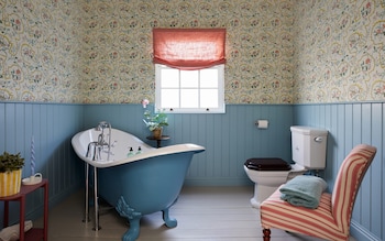
“To keep this look considered and interesting, I would avoid dark blue shades with dark reds as I find that quite a ‘heavy’ combination. Likewise, very pale blue and very pale red can feel too pastel and obvious. I find clients tend to be braver when it comes to using blue with red accents, as red can feel a little scary as a dominant colour; but used in small doses (such as on a chair or vanity) it is very uplifting and provides a quirky dimension to a scheme.”
Paint pairings to try
“Parma Gray is more of a blue than a grey and it works so well with Dead Salmon, a reddish pink colour; both by Farrow & Ball.”
“This may be the perfect blue/red combination for a study or a bathroom – Blue Blood by Paint & Paper Library with Preference Red by Farrow & Ball.”
Pink and red
Interior designer Henry Prideaux says:
“Pink and red shouldn’t really work, but they do, because they sit next to each other on the colour wheel so they are aligned – and they’re always a joyful combination to come home to.
“As with any set of colours, the tone is hugely important. I never want to put anything sharp with something dull because they just stand too far apart, so whether they’re both bright or both more pared back, if the tone is right, they should pair together well. I think it’s important to have one dominant colour rather than a 50/50 split, but I would also introduce a third colour, whether it’s cream, white or green, to help tie everything together and soften it all.”
Paint pairings to try:
“Scarlet ’n’ Rust with Leather III, both by Paint & Paper Library. Leather III combines a fabulous rusty red with the perfect plaster pink (this would be an amazing combination in a kitchen).”
“Faded Terracotta by Farrow & Ball, teamed with an accent in Fruit Fool, from the Farrow & Ball archive, gives a gentle contrast of light and dark.”
Disclaimer: The copyright of this article belongs to the original author. Reposting this article is solely for the purpose of information dissemination and does not constitute any investment advice. If there is any infringement, please contact us immediately. We will make corrections or deletions as necessary. Thank you.